P2- Sample Materials
P2
I will be producing sample materials to support my proposal
Mood board
For my mood board I used the covers of magazines to show what will be similar to mine. I will use a player on the front cover to show fans that the players are affiliated with the magazine. In this mood board I've also outlined the colors we will use which is the same as the clubs colors (red white and gold). I've also included pictures of the badge first team and badge to get across the sort of images that will be in the magazine. The last thing I've included in the mood board is the font I will use in the mass head which is a simple yet bold and attracting font.
Masthead Designs
For my masthead I chose to use the colours red white and gold due to that being the colours of the clubs crest usually. The magazine is also named the Read and White magazine which is why I used contrasting colours on the R and W. At the top of the logo I added DRFC to show that the magazine is affiliated to the club and cannot be mistaken. I used a sans serif font to keep it simple and easy to read for fans. In the magazine I may change the format of the writing and include "The red and White" next to the logo itself. This will depend on space on the front of the magazine.

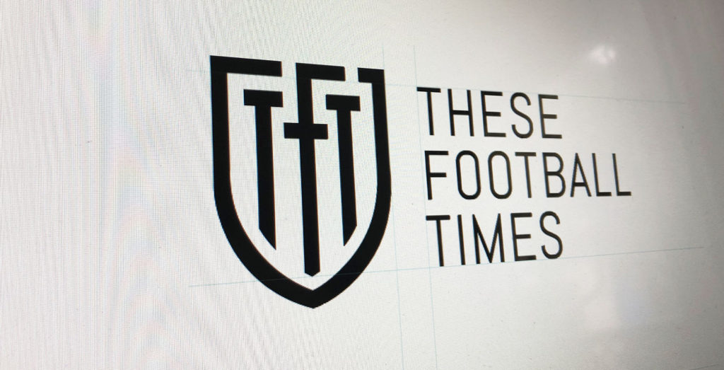
This is an example of another football magazine called the football times. They use simple colours and
a futuristic font encapsulated in what looks like a crest of a badge.

This is more advanced than my logo/masthead however harder to read and understand without the writing beside the logo. The brighter colours and friendlier font on my logo shows that the magazine is made specifically for the fans and Doncaster rovers. Whereas the other logo is plain which shows me it will be more serious and formal and neutral biased.
Visualization diagram
The visualization diagram shows what the front and back cover will look like after the magazine is created. The front includes a masthead with a player and extra information whilst the back cover is a badge and telling people to buy a season ticket. The simple design makes it easy to read and look at.
Sample photos
These are the samples of photos that i will be trying to replicate on the front of the magazine as i want to use player photos on the front cover. The reason i chose these photos are that they will suit the cover and will coincide with the target audience.
Photos imported from


Comments
Post a Comment